
Users often have distinct preferences for dashboard themes, influenced by factors such as mood, context, and surroundings. To enhance user comfort and experience, all the best applications offer changing theme functionality, allowing users to customize their interface according to their preferences and environmental conditions.In these cases, if you are using a third-party solution that is embedded in your frontend, where you might not have full control over their UI, could be a challenging issue. I’ll give one example to show this.
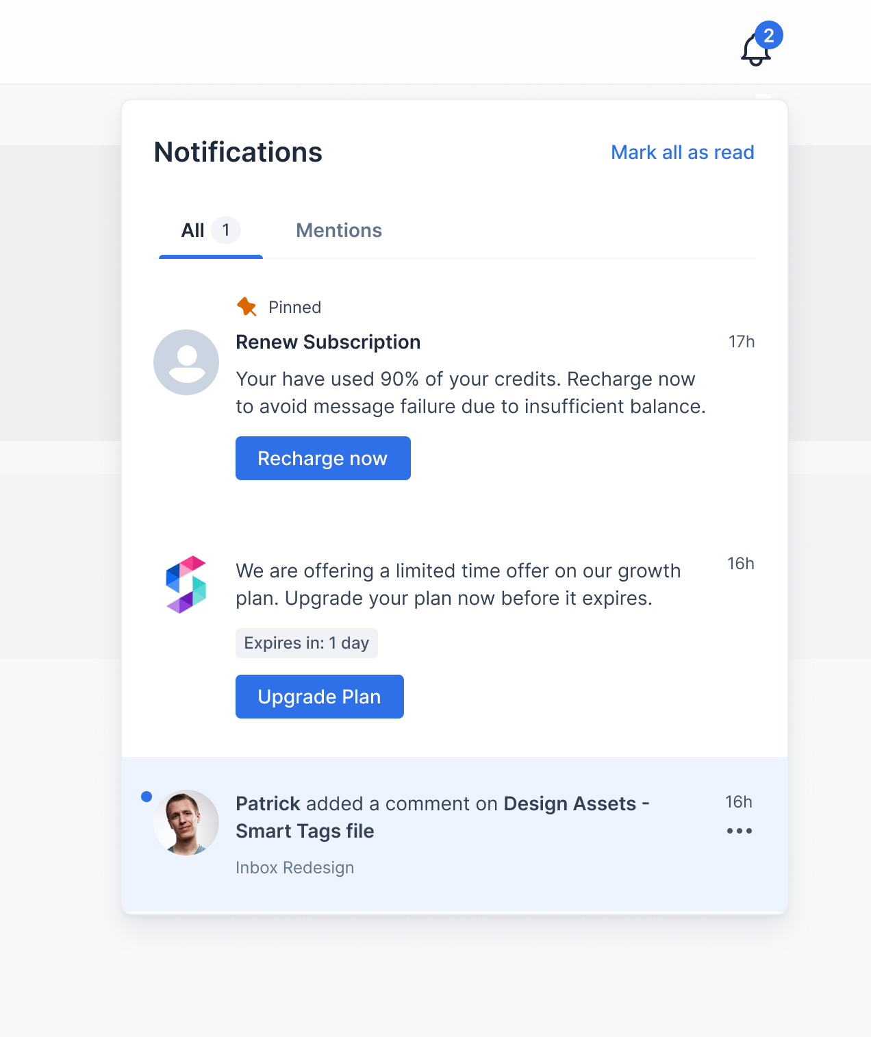
This is the dashboard stats of a writing tool I use, in two themes. I usually browse in black theme and have noticed this quite frequently that the ‘Number’ isn’t quite visible in dark theme. Although this may seem like a minor issue, it could mask important content that I need to see.

Troubleshooting such visibility problems can be challenging, as the component might be rendered correctly on the application-side, but the client-side theme changes (which many-a-times can be out of your control) can obscure the content. Overall, it effects the end-user experience, that no company would want.
We understand the importance of providing a seamless and visually consistent user experience across different themes and modes. To address this issue, we have incorporated custom props in our pre-built Inbox component, allowing you to easily integrate it into your React, Angular, Flutter, or web applications while maintaining a native look and feel.
To better understand how this functionality works, let's explore a demo application where we have implemented this capability. Check this first to understand the goal.
React Inapp Inbox Demo (suprsend-notificationapi.github.io)
Github: SuprSend-NotificationAPI/social-app-react-app-inbox
Once the demo application loads, follow these steps:
- Locate the bell icon in the top-right corner of the application and click on it to open the app-inbox notification panel.
- Initially, the dashboard is in dark mode by default. Observe how the Inbox component's design theme seamlessly matches the dark theme of the dashboard.
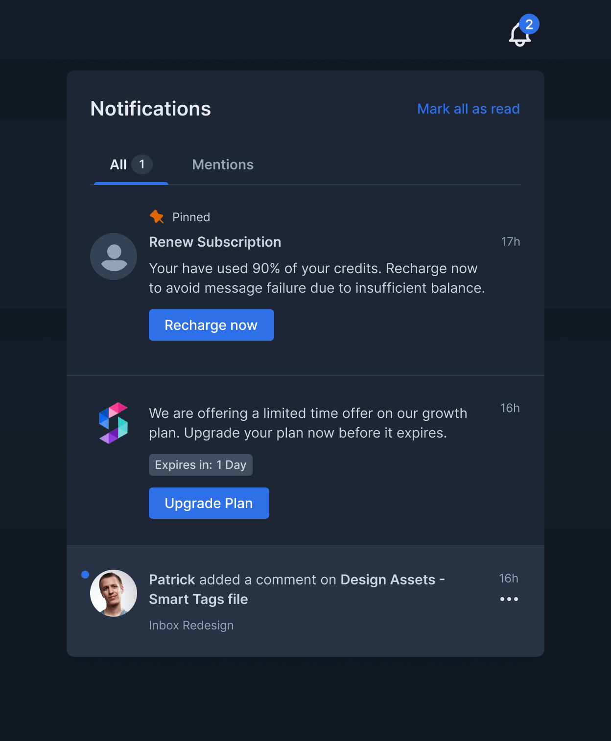
- Now, click on the theme switch button to toggle the dashboard theme to light mode.
- Return to the app-inbox notification panel, and you'll notice that the Inbox component has automatically adapted its appearance to a light theme, complementing the dashboard's new theme.
Let’s see how we achieve this functionality using SuprSend’s React Inbox.
Changing SuprSend App Inbox Notification Center Theme Dynamically
Setting themes for a static application is very easy with our pre-built react inbox component. You just need to define an extra prop where you initialize the inbox component.
Let’s check how to achieve the same in a dynamic manner. Here is the relevant Github code where we implemented this demo project for your reference: social-app-react-app-inbox/src/components at master · SuprSend-NotificationAPI/social-app-react-app-inbox (github.com)

Refactoring the Switch component to return the current theme state:
- Introduced a
useStatehook to manage the checked state of the switch component. - Utilized the
useEffecthook to set the initial state of the switch based on the system's preference for dark mode. - Modified the
handleChangefunction to update the checked state based on user interaction with the toggle switch. - Added a
refto access the checkbox input element. - Implemented the
updateBodyClassfunction to toggle the classes on the body element to apply the appropriate background theme. - Utilized the
onThemeChangeprop to call a function (passed from the parent component) to update the theme state based on the switch toggle.
Updating the Header component to manage the theme state and pass it to the SuprSend Inbox component:
- Introduced a
useStatehook to manage the theme state in the Header component. - Defined a
toggleThemefunction to update the theme state when the switch is toggled. - Passed the theme state as the
themeTypeprop to the SuprSendInbox component. - Passed the
toggleThemefunction as theonThemeChangeprop to the Switch component.
Ensuring that the SuprSend Inbox component could receive and apply the theme state dynamically:
- The SuprSendInbox component receives the theme state through the
themeTypeprop passed from the Header component and listen for changes to thethemeTypeprop to apply corresponding theme styles.
And, voila!But theme is not the only prop, which SuprSend helps you change. You can customize the overall appearance of the in-app inbox with these parameters: Check the documentation.
Why Customize React In-app Notification Centers?
A business may need to customize their React in-app inboxes due to various use-cases, such as:Branding Consistency:
- E-commerce App: An e-commerce app might want to customize the inbox icon and notification appearance to match their brand colors and overall aesthetic. This creates a more unified and recognizable user experience.
Content Personalization:
- Learning Management System (LMS): An LMS might want to display different notification types (e.g., assignment deadlines, course updates) with specific icons or colors for better user recognition and prioritization.
Actionable Notifications:
- Food Delivery App: A food delivery app could customize notifications to allow users to directly reorder a past meal or track their delivery driver in real-time within the notification itself.
Information Hierarchy:
- Social Media App: A social media app might want to prioritize notifications for mentions or direct messages with a bolder font or sound alert, while keeping less urgent notifications like friend requests more subtle.
- It would also need to showcase avatars of millions of its users, which would be complex at that scale.
Accessibility:
- Finance App: A finance app could offer a high-contrast theme option for the inbox to ensure optimal readability for users with visual impairments.
All of these use-cases are possible with SuprSend’s in-app inbox. To try out that out, head to our documentation.


