With changing needs in product communication, it's crucial for mobile and web applications to effectively communicate with their users. One way to do this is by utilizing in-app notifications, which allow developers to send timely and personalized messages to their audience. However, not all in-app notifications are created equal. The design and functionality of these notifications vary greatly depending on the intended purpose and the user's preferences. In this article, we will explore six main types of in-app notifications: notification bars, modals, in-app inbox notification feeds, toasts, hotspots, and tooltips.
We will also discuss how to create effective in-app notifications/ web inbox and why they matter for your application's success. Before that, you might want to check 5 Mobile Inbox Transactional Use-Cases That Businesses Are Using To Improve Customer Engagement?
6 Types of In-App Notifications and In-App Messages
1. Toast Notifications
Toast notifications are a type of pop-up notification that appears briefly on the screen, usually near the bottom or top, resembling a piece of toast popping up from a toaster. These notifications are commonly used in software applications, operating systems, and web browsers to inform users about events or updates without interrupting their current activities.
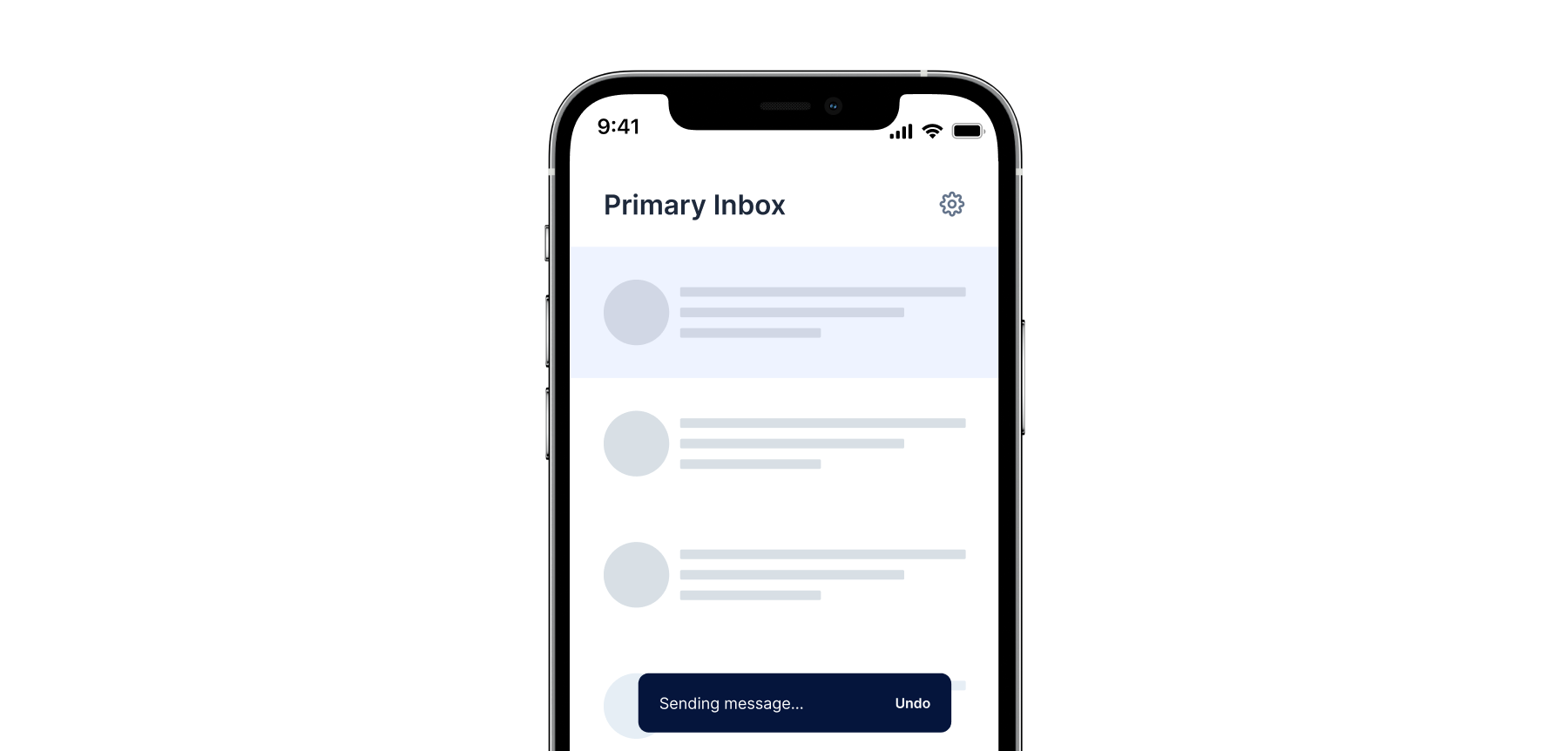
Key characteristics of toast notifications include:
- Brief Appearance: Short-lived pop-ups for quick information.
- Non-intrusive: No user interaction needed; they disappear on their own.
- Informative Content: Displays concise, relevant information.
- Customizable: Developers can adjust appearance and behavior.
- System Integration: Integrated into operating systems for consistency.
- User Control: Users can customize settings for display and notification types.
Examples of situations where toast notifications might be used include receiving new email messages, calendar reminders, instant messaging updates, or system alerts.
Did you know?
The term "toast" in this context is a metaphorical reference to the way a slice of bread pops up from a toaster when it's done toasting, drawing an analogy to the way these notifications "pop up" on the user's screen.
2. Notifications Feed in Inbox or Notification Center
The Notifications Feed in form of a bell icon Inbox or a Message Center is a pivotal element characterized by a distinctive bell icon, serving as a centralized hub for all persisted push and other notifications. This interactive feature allows users to click on the bell icon, granting them access to a dedicated inbox where they can review, manage, and revisit past notifications. Check Victoria's Secret in-app inbox case study here: How Mobile Inbox Increases User Engagement? (including a case study with inapp-inbox)

Unlike immediate, ephemeral notifications, the Notification Inbox provides a persistent and organized repository. Users can explore a chronological history of notifications, making it a valuable tool for referencing past updates, announcements, or interactions within the app.
The clickable bell icon signals a user-friendly approach, allowing individuals to engage with their notifications at their convenience. This feature is especially beneficial for users who may have missed or dismissed previous notifications, offering them a convenient means to catch up on important information. You can implement the in-app inbox notification center in just 2 steps. React Inbox Documentation
3. Modal Windows
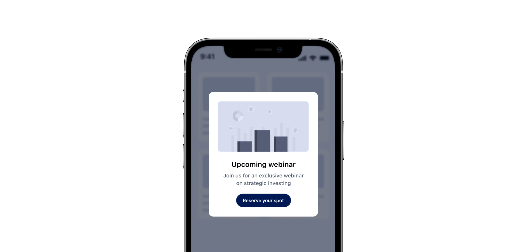
Modal windows are large, full-screen notifications that require the user's attention before continuing. They are often used to convey important information, such as changes to terms of service or security updates. Modal windows can be overwhelming if used excessively, so it's essential to strike a balance between keeping users informed and avoiding annoyances. Essentially you would also need to take care of notification hygiene, which we talked in details here: Maintaining Notification Center Hygiene - Expiring Outdated Messages in The InApp Inbox Notification Center
Example: An online banking app might display a modal window warning users of a potential data breach and prompting them to update their passwords.
4. Notification Bars
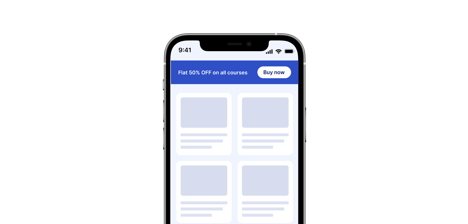
Notification bars are small, colorful notifications that appear at the top of the screen. They are typically used to inform users of non-critical updates, such as new features, special offers, or product releases. Unlike modal windows, which interrupt the user's workflow, notification bars are unobtrusive and can be easily ignored if desired.
Example: A fitness app might display a notification bar reminding users to drink water throughout the day.
3 Bonus In-App Message
Coachmarks
Coachmarks serve as interactive, step-by-step guides to introduce users to specific features or functionalities within an application. They are designed to facilitate a seamless onboarding experience, guiding users through a sequence of instructions. The content within each coachmark is carefully crafted to provide clear information and encourage users to explore and learn at their own pace.
Example: In a project management tool, coachmarks can be strategically placed to guide users on how to create and manage tasks effectively. Each coachmark in the sequence explains a different aspect of task management, ensuring users grasp the functionalities seamlessly as they progress through the onboarding process.
5. Hotspots
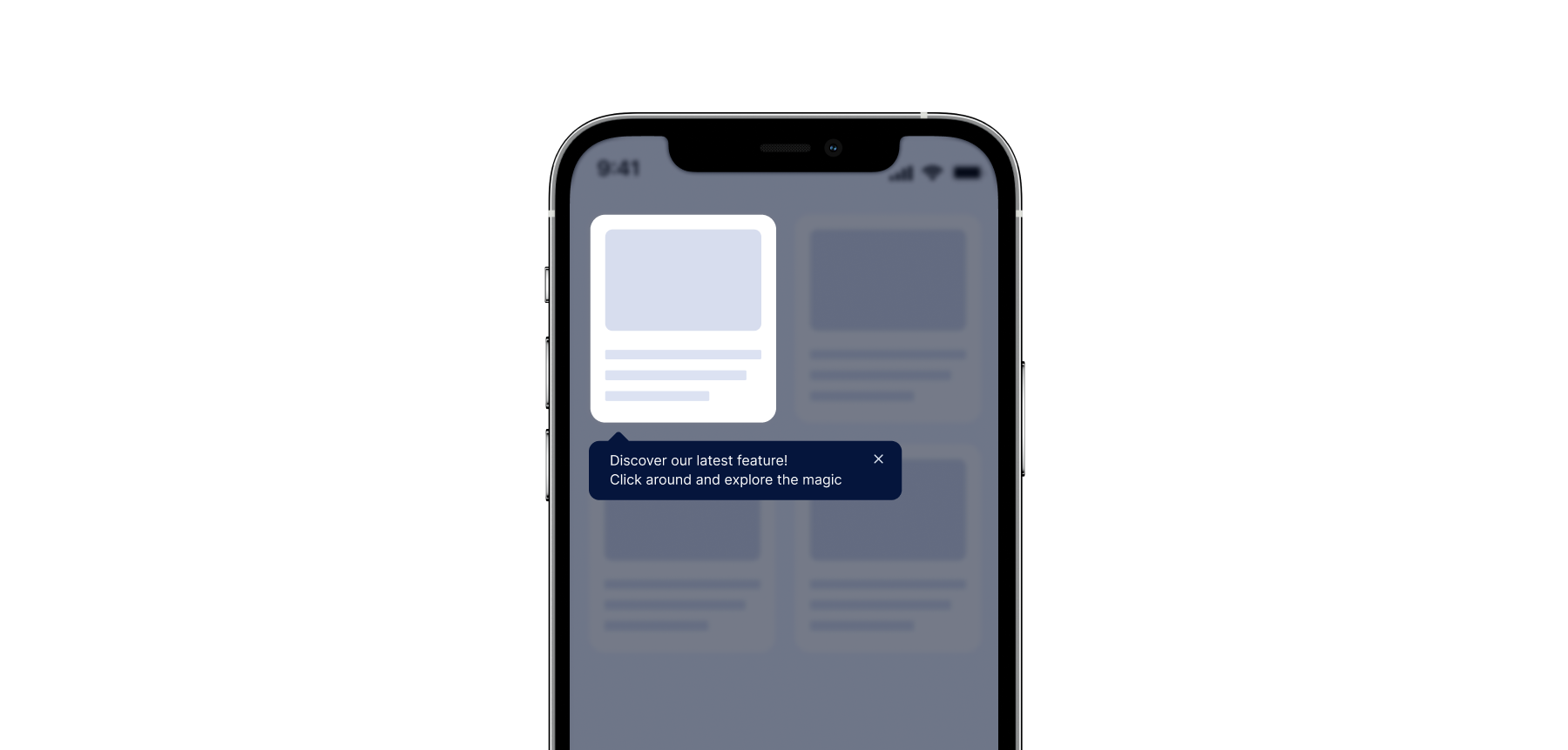
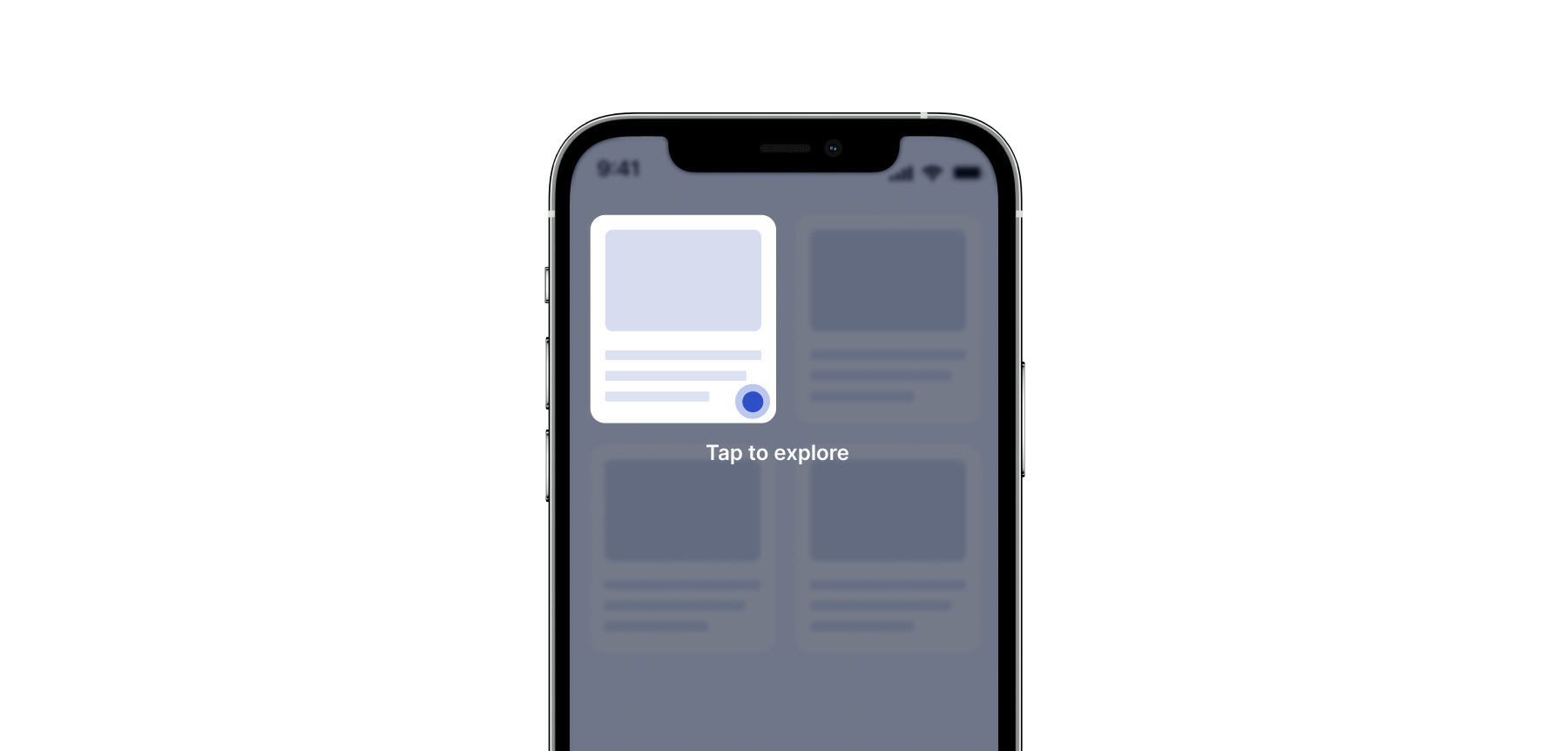
Hotspots are interactive areas strategically placed within an interface, acting as beacons to attract user attention to specific elements. They are particularly effective in signup onboarding flows or login pages. The content within a hotspot is designed to be concise yet compelling, aiming to entice users to explore, click, and engage with the highlighted area.
Example: SAAS companies can leverage hotspots by placing them strategically on a dashboard to draw attention to a new feature. The hotspot might showcase a brief, enticing message, encouraging users to click and explore the added functionality directly. Unlike coachmarks, hotspots don't necessarily guide users through a sequence but rather focus on making specific elements more discoverable.
To differentiate, coachmarks guide users through a sequence of steps, providing instructional content, while hotspots highlight specific areas, enticing users to interact without a predefined sequence.
Tooltips
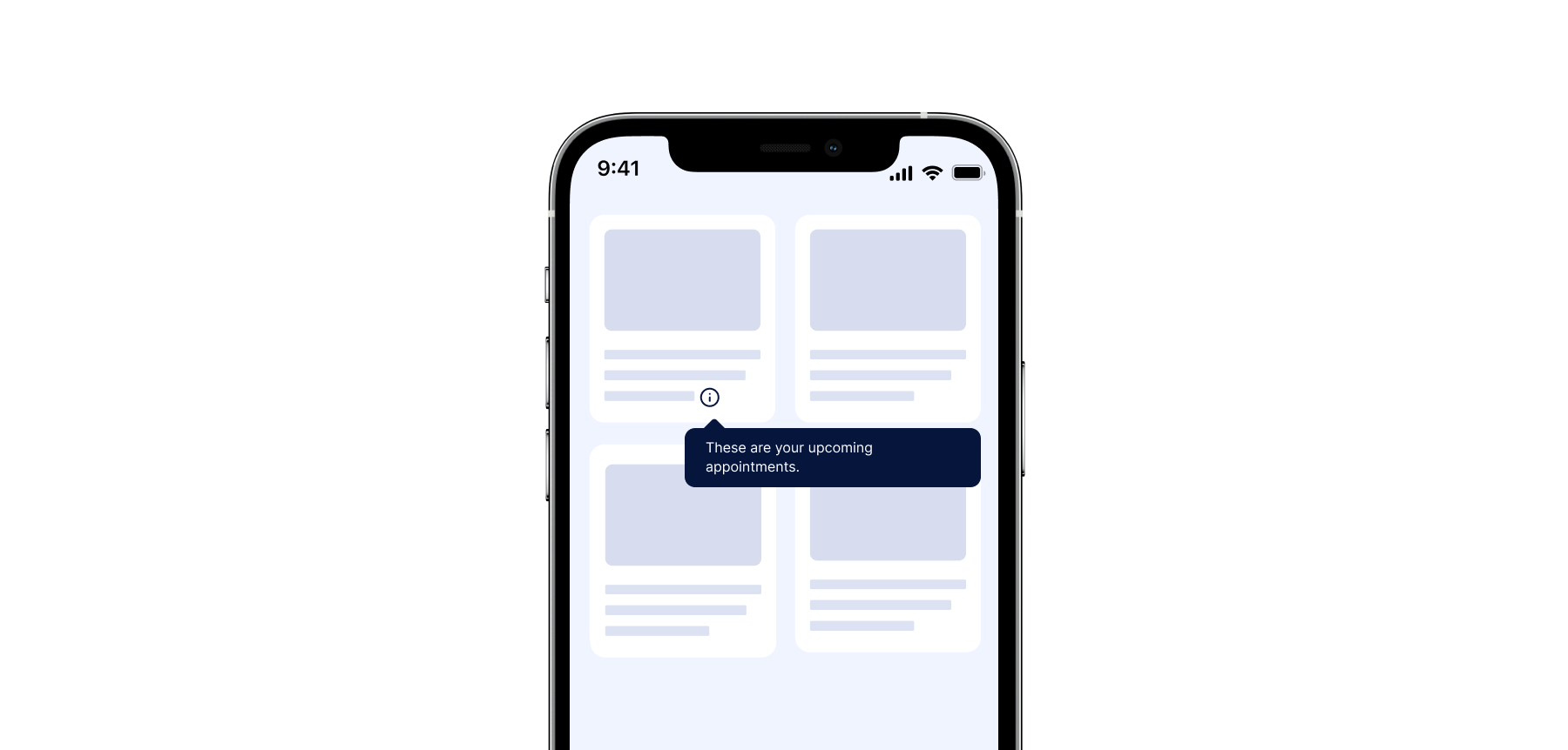
Tooltips are small, temporary notifications that appear near a particular element on the screen. They are commonly used to offer helpful hints or provide additional information upon request. Tooltips are versatile and can be triggered by hovering, clicking, or tapping an icon.
Example: A travel booking website might display a tooltip next to a search field explaining the difference between "one-way" and "round-trip" flights.
Why In-App Notifications Matter
Effective in-app notifications can improve user engagement, increase conversions, and enhance overall customer satisfaction. By sending targeted messages, businesses can encourage users to try new features, complete tasks, or make purchases. Moreover, well-designed notifications can help build trust and foster a positive brand image. Check out 11 Reasons to Use In-App Inbox Notifications In Your Product Communication Strategy.
Creating Effective In-App Notifications
To craft successful in-app notifications, consider the following best practices:
- Keep it simple: Ensure your messaging is concise and easy to understand. Avoid using technical jargon or complex sentences that may confuse your users.
- Choose wisely: Tailor notifications to specific types. Consider a push notification feed for messages which are important and need revisiting by the users.
- Be relevant: Only send notifications that are pertinent to the user's interests or current activity. Irrelevant messages can lead to frustration and decreased engagement.
- Use visual cues: Make your notifications visually appealing by incorporating colors, icons, or animations. This helps grab the user's attention and makes the message more memorable.
- Provide choices: Offer users options to customize their notification settings or opt-out entirely. Respecting users' privacy and preferences is crucial for building trust and maintaining a positive reputation. Did you know mobile In-App Inboxes Have 17% Higher Click Rates Than Push Notifications?
- Test and refine: Continuously monitor feedback from users and adjust your notification strategy accordingly. Analyzing performance metrics, such as open rates and conversion rates, can help identify what works best for your application.
Conclusion
In-app notifications and web inboxes play a vital role in enhancing the user experience and driving engagement within mobile and web applications. By understanding the differences between notification bars, inbox, modals, toasts, and tooltips, developers can tailor their approach to meet the unique needs of their audience. Remember to prioritize simplicity, relevance, and visual appeal while respecting users' preferences and privacy. With thoughtful design and strategic implementation, in-app notifications can significantly impact your application's success.
Testing Second Block
Working fine. To improve readability and create a visually appealing layout, consider dividing the content into two distinct sections, each with its own rich text block. This approach helps to break up long text and allows users to process the information more effectively. Between these two sections, include an inline banner that serves as a visual or informational divider. The banner can highlight a key message, call-to-action, or an important update, drawing attention to it without disrupting the flow of content. By placing the banner strategically, it not only enhances the overall design but also provides a natural pause between the two sections, making the content more engaging and easier to navigate.


